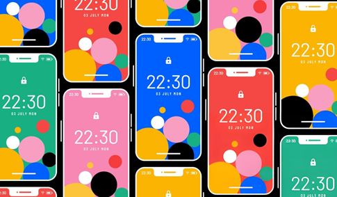
Color palettes are the visual language of user interfaces, playing a critical role in guiding user interaction, establishing brand identity, and creating a seamless and intuitive experience. For UI/UX designers, the ability to quickly develop professional-grade color palettes that are not only aesthetically pleasing but also functionally effective is paramount. Atmos is a dedicated color palette creation tool designed to help users make professional color palettes quickly, positioning itself as a valuable resource for UI/UX designers. With key features such as semantic color matching (e.g., success, warning, danger), color family limitations, and visualization of color relationships on the color wheel, Atmos provides the specialized tools that UI/UX designers need to efficiently craft compelling and usable interface color schemes.
In the realm of UI/UX design, color choices go beyond mere aesthetics; they are integral to usability and communication. Colors are used to indicate interactive elements, provide feedback on user actions, convey status information (like errors or successes), and establish visual hierarchy. Creating a cohesive color palette that addresses all these functional requirements while also aligning with brand guidelines and maintaining visual harmony is a complex task. UI/UX designers require tools that can simplify this process, allowing them to quickly generate, refine, and apply palettes that meet both design and usability standards.
Atmos is built with these specific needs in mind, identifying itself as a color palette creation tool designed to help users make professional color palettes quickly. This emphasizes the tool's focus on both the quality and speed of palette generation – crucial factors for UI/UX designers working on dynamic projects with often tight deadlines. The explicit mention of being a valuable resource for UI/UX designers underscores that its features and workflow are tailored to the unique demands of designing for user interfaces.
One of Atmos's standout features particularly relevant to UI/UX design is semantic color matching (e.g., success, warning, danger). Semantic colors are vital in user interfaces for providing immediate visual cues about the status of a system or a user's action. Green typically signifies success, yellow indicates a warning or caution, and red denotes an error or danger. Atmos assists designers in defining and managing these critical semantic colors within their palette, ensuring consistency in how status is communicated throughout the interface. This feature simplifies the process of creating a functionally robust color system that enhances user understanding and reduces ambiguity.
Another valuable feature is color family limitations. This allows UI/UX designers to constrain their palette to specific ranges of hues or color harmonies. This is particularly useful for maintaining visual consistency within a design system, adhering to established brand guidelines that may dictate a specific color palette, or intentionally creating a minimalist or themed aesthetic. By limiting the color families, designers can ensure that their palette remains cohesive and visually harmonious, contributing to a polished and professional user interface.
Atmos also incorporates visualization of color relationships on the color wheel. The color wheel is a fundamental tool in color theory, illustrating the relationships between different hues (complementary, analogous, triadic, etc.). By visualizing their chosen colors on the wheel, UI/UX designers can gain a better understanding of how those colors relate to each other, explore different color harmony principles, and make informed decisions about combining colors for aesthetic appeal and visual balance within the user interface. This visual guidance helps designers create palettes that are not only functionally sound but also aesthetically pleasing.
Collectively, these features make Atmos a valuable resource for UI/UX designers by simplifying the creation of palettes that are both visually appealing and functionally effective for user interfaces. The tool accelerates the process of defining semantic colors, ensures visual cohesion through color family control, and provides insightful visualization of color relationships. This allows UI/UX designers to efficiently develop color palettes that enhance usability, improve accessibility, and contribute to a positive and intuitive user experience.
In conclusion, Atmos stands as a specialized and highly effective color palette creation tool that is particularly well-suited to the needs of UI/UX designers. By focusing on helping users make professional color palettes quickly and offering key features like semantic color matching, color family limitations, and visualization of color relationships on the color wheel, Atmos provides the essential tools for crafting functional and aesthetically pleasing user interfaces. The platform empowers UI/UX designers to efficiently develop color palettes that enhance usability, accessibility, and the overall user experience, contributing significantly to the success of digital products.