Bolt: Powering Best-in-Class Digital Experiences with Pega Digital's Design System
In the competitive landscape of enterprise software, particularly in areas like CRM and business process management where Pega Systems operates, delivering digital experiences that are not only functional but also intuitive, scalable, and aesthetically pleasing is crucial for user adoption and business success. Creating and maintaining such "best of class digital experiences" across a range of complex applications requires a unified and robust approach to design and development. This is where the Bolt Design System from Pega Digital plays a pivotal role, providing a comprehensive suite of robust Twig and Web Component-powered UI components, reusable visual styles, and powerful tooling to empower developers, designers, and content authors in building, maintaining, and scaling these high-quality digital assets.
The Bolt Design System is clearly positioned as the central engine for crafting Pega Digital's user interfaces. Its description highlights a focus on providing a solid, code-based foundation for digital product creation. The inclusion of robust Twig and Web Component-powered UI components signifies a strategic choice of technologies to achieve flexibility and reusability. Twig, a popular templating language, allows for dynamic and reusable HTML structures, while Web Components provide a framework-agnostic way to create encapsulated, reusable custom elements for the web. By offering components built with both technologies, Bolt caters to different development needs and environments within Pega, ensuring that teams can leverage the design system regardless of their specific tech stack. The term "robust" suggests that these components are built to be reliable, well-tested, and capable of handling the complexities often found in enterprise applications.
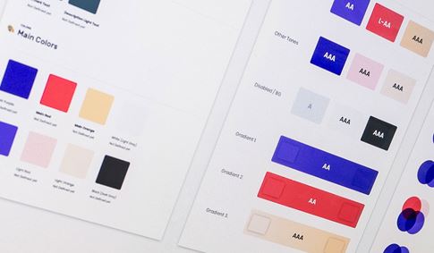
Beyond the functional components, Bolt provides reusable visual styles. This encompasses the codified aesthetic elements that define the look and feel of Pega's digital products – the specific color palettes, typography hierarchies, spacing rules, iconography, and overall visual treatments that contribute to the brand identity and ensure a consistent appearance across all interfaces. By providing these reusable styles, Bolt ensures that designers and developers can easily apply the correct visual attributes to their interfaces, maintaining a unified and on-brand look without having to
reinvent styles for each new project or component.
The inclusion of powerful tooling further enhances the value and usability of the Bolt Design System. These tools are likely designed to streamline the design and development workflow, potentially including automated processes for generating code from design specifications, tools for managing and documenting components, frameworks for testing the accessibility and responsiveness of interfaces, and integrations with popular design and development software. These tools empower the teams using Bolt to work more efficiently, maintain a higher standard of quality, and ensure that the design system is effectively integrated into their daily workflows.
The comprehensive nature of Bolt is reflected in its target audience: it is designed to help developers, designers, and content authors. This inclusivity highlights a recognition that creating best of class digital experiences is a collaborative effort involving multiple disciplines. Bolt provides resources and guidance tailored to the needs of each group. Developers benefit from the coded components and tooling, designers leverage the visual styles and component library, and content authors can utilize guidelines and potentially templates to ensure that the content within digital products is presented consistently and effectively. This shared resource fosters better collaboration and communication between these teams.
The ultimate purpose of Bolt is to help teams build, maintain, and scale best of class digital experiences. "Build" refers to the initial creation of digital products, which is accelerated by the
reusable components and tooling. "Maintain" emphasizes the ongoing effort required to keep digital products up-to-date, secure, and performant; Bolt facilitates this by providing a centralized system for managing design and code changes. "Scale" addresses the need for digital experiences to grow and evolve alongside Pega's business and user base; Bolt's robust and flexible architecture, built on reusable components and a clear system, enables this scalability. "Best of class" sets a high standard for the quality, usability, and performance of the digital products built using Bolt.
The benefits of leveraging the Bolt Design System are significant for Pega Digital and its users. For Pega's internal teams, Bolt fosters increased efficiency and consistency in the design and development process, accelerates time to market, and improves collaboration. For the users of Pega's digital products, Bolt contributes to a more intuitive, reliable, and high-quality user experience. The consistent interfaces and adherence to best practices embedded within Bolt make Pega's complex enterprise software easier to learn, use, and navigate, ultimately improving user productivity and satisfaction.
In conclusion, the Bolt Design System is a powerful and comprehensive asset for Pega Digital, providing the essential components, styles, and tooling needed to build, maintain, and scale best of class digital experiences. By leveraging robust Twig and Web Component-powered UI components, reusable visual styles, and powerful tooling, Bolt empowers developers, designers, and content authors to collaborate effectively and create high-quality, consistent, and scalable digital products that meet the demanding needs of enterprise software users. Bolt is the foundational system that helps Pega Digital forge exceptional digital experiences in the world of CRM and business process management.


