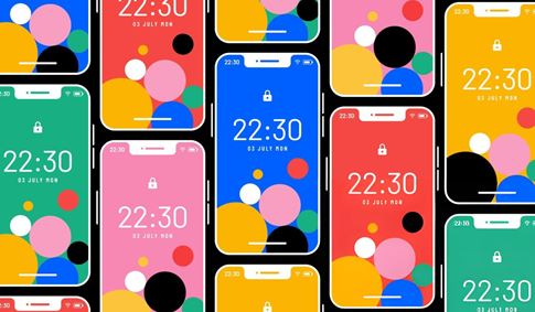
Color Safe
Empowering designers with beautiful and accessible color palettes based on WCAG Guidelines of text and background contrast ratios
Visit Website
Empowering designers with beautiful and accessible color palettes based on WCAG Guidelines of text and background contrast ratios
Visit WebsiteColor Safe is a website that aims to empower designers with beautiful and accessible color palettes that adhere to the WCAG (Web Content Accessibility Guidelines) guidelines of text and background contrast ratios. The website provides an easy-to-use color palette generator that takes into account the specific needs of individuals with visual impairments.
One of the most important considerations when designing for accessibility is the contrast between text and background colors. This is especially important for individuals with visual impairments, as low contrast can make it difficult or impossible to read content on a website. The WCAG provides specific guidelines for text and background contrast ratios to ensure that content is readable by individuals with visual impairments.
Color Safe takes these guidelines into account when generating color palettes. Users can choose a primary color and the website will generate a range of complementary colors that meet the WCAG contrast ratio guidelines. The website also provides options to adjust the contrast ratio to meet specific needs, such as higher contrast for individuals with low vision.
In addition to providing accessible color palettes, Color Safe also offers a helpful feature for designers: the ability to preview how text will appear on different background colors. This is important because text can appear differently depending on the color behind it. By previewing text on different background colors, designers can ensure that their content is readable and accessible to all users.
Overall, Color Safe is a valuable tool for designers who want to create beautiful and accessible color palettes that meet WCAG guidelines. By taking into account the needs of individuals with visual impairments, Color Safe ensures that all users can enjoy and interact with the content on a website.
Color Safe is a website that provides designers with accessible color palettes that adhere to the WCAG guidelines for text and background contrast ratios.
Consideration for accessibility is essential in color palettes because low contrast can make it difficult or impossible to read content on a website, especially for individuals with visual impairments.
Color Safe's generator takes into account the specific needs of individuals with visual impairments and offers a feature to preview how text will appear on different background colors.
Color Safe's generator allows users to choose a primary color, and it generates a range of complementary colors that meet the WCAG contrast ratio guidelines.
Designers who want to create beautiful and accessible color palettes that meet WCAG guidelines can benefit from using Color Safe.
This specific page on Digital Synopsis, a website renowned for covering design, advertising, and visual culture, features a curated collection of beautiful color gradients specifically intended for use as backgrounds. Leveraging Digital Synopsis's expertise in curating inspiring design examples and resources, this page serves as a visually rich gallery showcasing aesthetically pleasing gradients. It provides designers with a source of inspiration and potentially links to external sources where these gradients can be obtained or tools that can be used to recreate them, effectively highlighting the diverse and effective use of gradients in background design.
Gradient Cards, hosted on cssgears.com, is likely an online resource specifically dedicated to providing examples and the corresponding code for creating ""cards"" – a common UI element used for organizing and displaying content – that incorporate gradients in their design. This website would serve as a source of inspiration and a practical utility, offering a collection of card designs featuring gradient backgrounds, borders, or other visual effects, along with the necessary CSS code for front-end developers and designers to easily implement these visually appealing and modern cards within their web projects.
EggGradients, is a unique online resource that offers gradients with a specific and unconventional style or theme, possibly related to eggs or organic, rounded shapes. The quirky name ""EggGradients"" immediately suggests a distinct visual approach to color transitions. This website would likely showcase a curated collection of gradients that are soft, rounded in their appearance or transition, or feature color palettes reminiscent of egg shells (whites, creams, pastels) or yolks (warm yellows and oranges). It provides designers with a source of unconventional and potentially pastel or organic-looking gradients that can add a unique touch to their design projects.
Colorfiy, likely a broader tool or platform related to color (potentially offering color palette generation, analysis, or organization), includes a specific section dedicated to gradients, found at the ""/gradients"" URL. This part of the website focuses on providing resources related to gradients, possibly including a gradient generator for creating custom blends, a collection of pre-designed gradients for inspiration and use, or tools for applying gradients to colors or designs. By integrating gradient capabilities within a larger color-focused platform, Colorfiy /gradients offers designers a cohesive environment for working with both fundamental color choices and dynamic color transitions.
Cool Backgrounds.io is a website that serves as a comprehensive resource for designers seeking to create visually interesting backgrounds. While it prominently features gradients among its offerings, the platform provides a variety of tools and resources for generating unique backgrounds using different techniques, including gradients, particles, and shapes. This website functions as a source of inspiration and practical tools for designers looking to create engaging backgrounds for websites, presentations, or other digital creations, offering a range of styles that go beyond simple solid colors or static images.
Gradient Buttons, hosted on colorion.co, is a resource specifically focused on showcasing examples of buttons styled with gradients and providing the corresponding code. This website offers a collection of pre-designed buttons featuring various gradient styles, colors, and hover effects, along with the necessary CSS code. It serves as a practical resource for web designers and developers looking to easily incorporate visually appealing and modern gradient buttons into their user interfaces by providing ready-to-implement code snippets.
The Mesh Gradients Plugin, found on meshgradients.com (a site that also hosts a collection of mesh gradients), is likely a software plugin specifically designed for creating mesh gradients directly within a popular design software application such as Figma, Sketch, or Adobe XD. Unlike external tools or collections that require importing and exporting, this plugin would integrate mesh gradient creation and editing capabilities directly into a designer's existing workflow within their preferred design environment, allowing for the interactive creation and editing of mesh gradients without leaving the design application.
Gradient King, hosted on Vercel, is likely a powerful or feature-rich gradient generator designed to be a top-tier tool for creating gradients. Its name, ""King,"" suggests a comprehensive set of features and a high level of control over the gradient creation process. This web application would provide advanced options for designing gradients, potentially including support for more complex gradient types, blending modes, or diverse export options, aiming to be a go-to resource for designers who require extensive control over their gradients and seek a sophisticated tool for their visual projects.
ffflux, found on fffuel.co, is likely a tool or resource for generating fluid or flowing gradients, possibly using noise or procedural generation. The name "ffflux" suggests a sense of movement or flow. This tool would enable designers to create gradients that have a more organic, less linear appearance, potentially incorporating noise or other effects to create unique and dynamic color transitions that resemble fluid or abstract art, offering a way to generate visually interesting and non-standard gradients.
Gradientos.app is another web application focused on color gradients. The name is likely a play on "gradients," possibly in Spanish or with a similar linguistic root. This tool would provide a platform for users to create, customize, and potentially share color gradients, offering a dedicated space for working with gradients and providing various options for controlling their appearance and generating the necessary code or assets for use in design projects.