BLOG
UI Tools Mobile Menu
Suggest Tool
Friday Design System

Friday Design System

Friday Design System (FDS) is a Design System accelerator that will assist you in quickening the development and design processes. It includes open-source components and modules that spare you the trouble of creating a Design System from start.

Visit Website

About Friday Design System

Friday Design System (FDS) is a Design System accelerator that will assist you in quickening the development and design processes. It includes open-source components and modules that spare you the trouble of creating a Design System from start.

FDS is especially designed to facilitate multi-brand experiences for digital enterprise applications and e-commerce. Our team has extensive experience implementing customer journeys for the telecom and BFSI industries, and we have used this experience to ensure that FDS offers components, API platforms, and other core components to speed up the implementation of digital customer journeys for multi-branded experiences with cross-platform support in multiple development frameworks, such as React & Angular.

A complete design system called FDS enables you to begin creating multi-branded experiences. Our team has established the fundamental elements, including the documentation, procedures, organizational structure, metrics, and distribution models. Accessibility standards have been taken into account, and every component has been thoroughly tested.

The Friday Design System consists of:

Design Kit: A collection of adaptable, dependable, and easily accessible parts created and maintained in Figma. Best practices and instructions for using each component are also provided, along with a list of supported variations.

Storybook documentation shows development-ready components from Angular and React, as well as usage instructions and alternatives.

Component Library: A collection of static components that will speed up the implementation of your design system and are built to facilitate multi-brand experiences in the most widely used frameworks, such as Angular and React.

following items in the Design Kit V.1.1:

Design Language

  • Themeable components for your brand colours/fonts
  • Layout & Grid System: Breakpoints (small, medium, large & extra large devices)
  • Typography: Font sizes, styles, font-weight, letter spacings and line-height etc
  • Iconography: a set of font icons
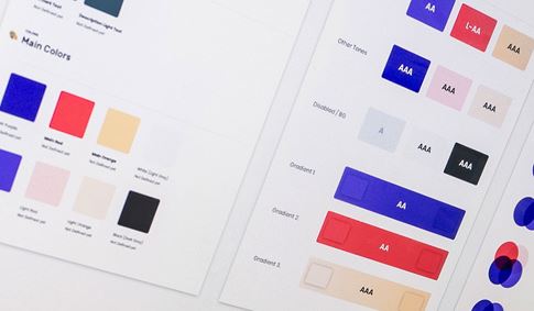
  • Colours: Primary, Secondary, error, warning, success etc
  • Spacing Units

Components

  • Buttons ( Primary, Secondary, Clear)
  • Input
  • Check Box
  • Radio Button
  • Select
  • Tooltip
  • Popover
  • Modal
  • Toast Notifications

Blog Posts About Design System

Related Products View All
P
Pluralsight Design System

The Pluralsight Design System strives toward a cohesive design language for Pluralsight’s products, a shared vocabulary for their teams, and basic building blocks to accelerate development.

H
Human Interface Guidelines

Get in-depth information and UI resources for designing great apps that integrate seamlessly with Apple platforms.

S
Seek Style Guide

The SEEK styleguide's purpose is to enable the creation of content that will assist our users to complete tasks easily and hopefully enjoy the experience.

S
ServiceNow Design System

The ServiceNow Design System is a living system that empowers us to design and achieve a consistent, efficient, and high quality visual language that brings cohesion and familiarity to the user experience across the platform.

N
Nachos

Nachos is Trello's design system. This comprehensive guide and resource library contains everything you’ll need to design with us, including our core principles, visual design and interface components.

P
Photon Design System

Photon is the Firefox design language to build modern, intuitive, delightful experiences, for products across all platforms – from mobile to desktop, from TV to the next big thing.

P
Predix Design System

Our user interface components enable you to quickly and easily create Industrial Internet web applications that run on dedicated Predix services and data.

C
Canvas Design System

This library showcases the building blocks that make up Hubspot's design system, from colors and typography to React-based components and data visualization tools.

G
Global Experience Language (GEL)

GEL is the BBC's shared design framework which enables us to create consistent and delightful user experiences across all of our Digital Services.

Y
Yelp Styleguide

The styleguide is a resource that provides a common language around Yelp’s UI patterns. We use it to maintain modular front-end code and visual consistency across the web app.

Suggest Product